Understanding the Science Behind Brand Color Choices
Color is a very subjective matter. What is “olive” to one person is “army green” to another, and “baby-poop green” to someone else. There’s no argument that color perspective is psychological and downright prejudiced. But what is significantly more complicated is choosing the right color for someone else, specifically a client. Should a technology company be yellow? Should a hospital logo use red? Should an oil company consider purple? Yes and no. It really depends on the company’s positioning in marketing and how they want to be received by the public.
It’s safe to say that basic colors already have connotations that are well-known. For instance, if I asked someone what comes to mind about the color green, they would probably say, “grass”, “trees”, or “money”. If I asked about the color blue, I would probably get the response of “sky”, “water”, or “sadness”. Simply put, colors mean things to people, and figuring out what color is appropriate for a client actually has some science behind it.
“Simply put, colors mean things to people, and figuring out what color is appropriate requires understanding the science behind color choices.”
Studies in the psychology of color date back as far as the Egyptians. Yet, it was Carl Jung that pioneered the science of color that we know today. Through his comprehensive observations, he was able to determine that colors have meanings, which he formulated for psychotherapy. Artists use these same techniques to create subconscious messages for their audience. The color red can evoke passion, aggression, heat, or hunger. Blue is stable, tranquil, cold, or sad. Yellow is honorable, loyal, warm, or cautionary. Based on the brand strategy, an artist must determine the subconscious message and choose a color that reflects that message.
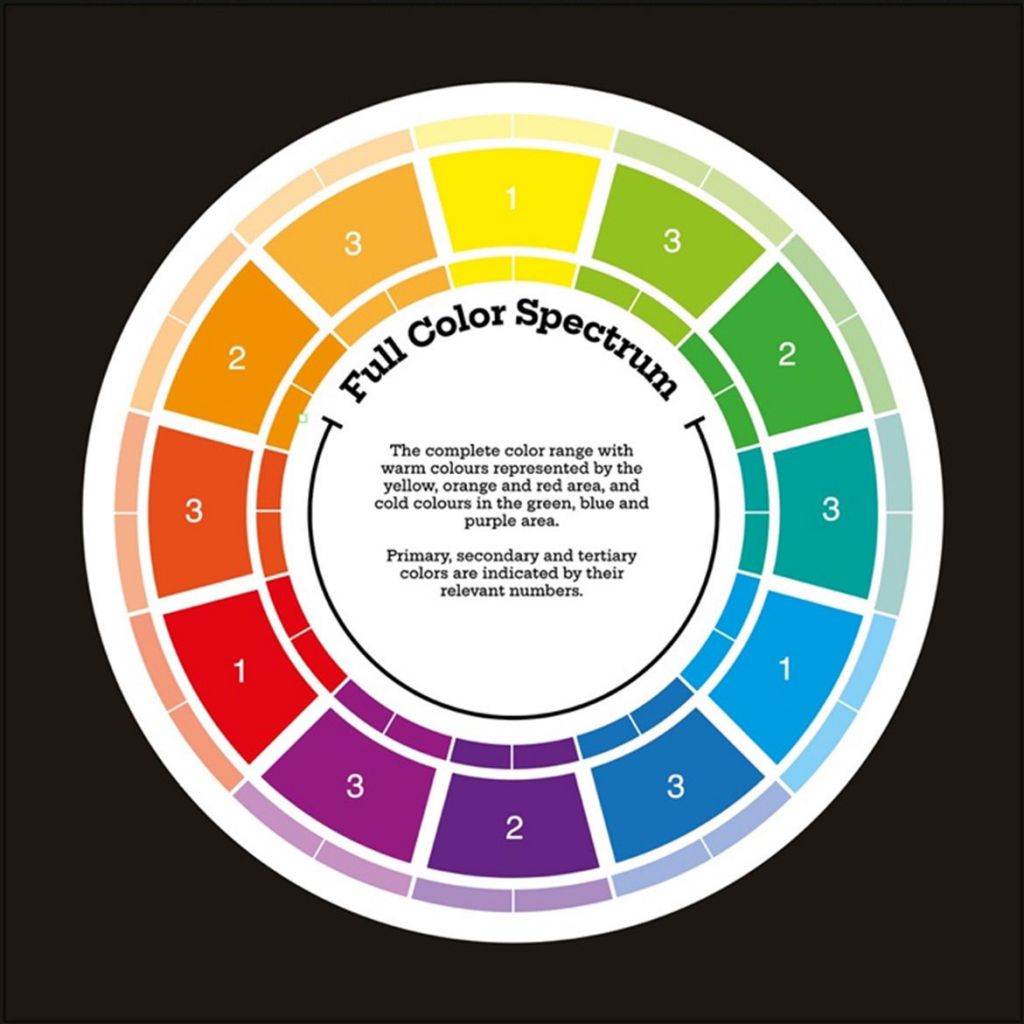
However, as we all know, a brand isn’t necessarily a single color. The logo might be one color but what about the secondary and tertiary colors? These colors also reflect the emotions that we want to convey to the public. Oftentimes, artists like to go straight to the complimentary colors, which are the colors that are directly opposite of the chosen color on the “color wheel”, as shown below.

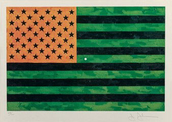
The next logical question is how someone figured out the complementary colors? First, the primary colors were established, red, blue, and yellow. The complementary colors were derived from mixing the leftover primary colors (e.g., the complementary color of red would be a mixture of blue and yellow, which makes green). This is also reinforced by our own eyes in a phenomenon called “afterimage”. Afterimage is defined by Britannica as, “The visual illusion in which retinal impressions persist after the removal of a stimulus, believed to be caused by the continued activation of the visual system.” The renowned artist, Jasper Johns, gave us a perfect example of how it works. If you stare at the dot at the center of the flag below for 20+ seconds and then close your eyes, you’ll see the U.S. flag in its proper colors:

So, yes, there is a method for choosing the proper colors for a brand – and it’s based on science. But that’s not to say that an artist cannot be inspired to use a color that’s a bit off-brand, which is okay, if they can defend it logically.
Also, the brand might face a sea of competitors that all look the same and use the same color palette. If the brand truly wants to break free from the herd with a unique color scheme, then all bets are off.

About Hallaron Advertising Agency
Kelley Cain is the Sr. Creative Director and manages the creative team in developing all client branding and advertising. Kelley has extensive experience in product branding, collateral and package design, complete ad campaign concept and development, video production, website design, copy writing and trade show & event development.
(281) 299-0538
2001 Timberloch Place, Suite 500
The Woodlands, Texas 77380

